
Choosing Ultra Matt, Matt or Silk Matt with Junckers MT500 Floor Lacquer
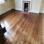
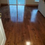
Put the same oak floor in two identical rooms and change only the sheen. The spaces can feel surprisingly different. One floor seems quiet and close to freshly sanded timber. The other catches window light, defines the grain and looks more deliberately finished. The ‘best’ look comes down to personal preference.
Junckers MT500 Floor Lacquer is available in Ultra Matt, Matt and Silk Matt. Your choice changes how the floor reflects light and how strongly you notice boards, knots and pattern. This guide helps you choose by looking at the room, timber and lighting rather than treating sheen as a label on a container.
How Sheen Affects Wooden Floor Appearance
Sheen is an interaction between the floor and the light falling on it. A lower sheen scatters more light, so reflections look softer and less distinct. As sheen increases, highlights become easier to see and the floor can appear brighter or more defined from certain angles.
Think of a south-facing kitchen with wide glazing. Afternoon sun can travel across the boards and make reflections obvious, so an understated finish may calm the room. In a darker hallway, where light arrives from a doorway or a few ceiling fittings, a little more sheen can give the surface extra presence.
Evening light changes things again. Pendant lights, spotlights and lamps create smaller, stronger highlights than diffuse daylight. So just how the surface looks at midday is not everything. You are choosing how the floor responds to the light you actually live with, from morning sunshine through dull Irish afternoons to artificial light at night. That difference becomes noticeable surprisingly quickly.
Grain and Pattern Become More or Less Visible
Wood already carries its distinct traits. Oak can show grain, colour shifts and occasional knots. Wider boards make those natural changes easy to read, while herringbone and other parquet layouts add a layer of geometry. Sheen determines how ‘loud’ those effects are.
With less reflection, your eye tends to settle on the timber itself. Grain and board variation can feel softer because bright highlights are not constantly moving across the surface. Increase the sheen and those highlights can trace board edges, emphasise changes in grain direction and make a patterned floor feel more animated as you walk through the room.
Junckers MT500 Floor Lacquer dries to a colourless film. The topcoat is not painting an opaque colour over your floor. Instead, the finished appearance comes from the timber, any primer beneath it and the way the chosen sheen handles light.
So do not only focus on which option looks shinier. Look at what happens to grain, joins and pattern. On a straight-board floor, extra definition may be welcome. On a busy parquet with natural variation, a quieter surface may let the pattern remain clear without making every change in direction compete for attention.
Ultra Matt for a Quiet Low Reflection Finish
Ultra Matt gives Junckers MT500 Floor Lacquer its lowest-reflection character. The floor still has a protective lacquer film, but visually the coating steps back. On pale oak, ash or other light timbers, that can keep the surface close to the subdued character people often associate with freshly sanded wood.
The effect is useful when you want timber to sit comfortably within the room rather than read as a polished feature. Highlights are restrained, so your eye is less likely to follow reflections from windows or lamps. Instead, the boards, furniture and architecture can work as one composition.
That does not mean Ultra Matt makes every floor look raw or identical. Wood species, grain, primer and natural colour are still key. Think of Ultra Matt as reducing the visual volume of the lacquer. It allows the floor to contribute texture and warmth without announcing the coating whenever daylight or artificial light changes.
Rooms Where Ultra Matt Is Ideal
Ultra Matt is comfortable in bright, open spaces where daylight already provides movement. If your kitchen and living area has large windows, pale walls and reflective worktops, another shiny surface may make the room feel busier than intended. A low-reflection floor can steady the scheme.
It also suits contemporary interiors built around simple materials. Timber, plaster, stone, linen and matte cabinetry often sit naturally beside a quieter floor because no single surface fights for attention.
Look at how much texture is already present. Strong oak grain, patterned rugs, veined stone and detailed joinery may provide all the visual interest you need. Ultra Matt can become the calm background. In a very plain room, however, more reflected light may give the timber useful definition and stop the floor feeling flat instead.
What to Check Before Choosing It
Do not choose Ultra Matt only because someone calls it the most natural-looking finish. Natural means different things in different homes. For one person it means almost no visible coating. For another it means the richer appearance timber takes on after finishing.
Judge the sheen on your wood species and, ideally, in the room. A pale oak sample under showroom lighting can look different beside your kitchen windows at 4 p.m. Check it again after dark with your lamps and lights on.
Change your viewing angle too. Stand at the doorway and look along the boards rather than only straight down. Ultra Matt earns its place when the quieter response suits the whole space.
Matt for a Balanced Everyday Look
Matt sits between the restrained character of Ultra Matt and the stronger light response of Silk Matt. With Junckers MT500 Floor Lacquer, that makes it useful when you want the floor to look clearly finished without seeing prominent reflections each time you cross the room.
There is enough surface response to give board edges and grain definition. Daylight can move gently across the timber, helping variations in oak or beech read clearly, yet the floor remains comparatively subdued. The effect does not push strongly towards either a near-raw appearance or a more polished presentation.
Matt also lets different parts of the room share attention. Your floor remains visible, but cabinetry, furniture, artwork and textiles still have space to lead. If you want to notice the timber without making its sheen one of the first things you see, Matt provides a balanced middle position that works comfortably with many interior styles.
Rooms Where Matt Is Ideal
Matt works in rooms that have to look good under several kinds of light. A family kitchen might be bright in the morning, grey on an overcast afternoon, then lit by pendants and under-cabinet lighting at night. A balanced sheen can handle those changes without feeling different each hour.
It also suits hallways and connected ground-floor spaces where one finish moves between darker and brighter zones. The floor keeps definition in shaded areas while staying controlled near glazed doors or larger windows.
For mixed-style interiors, Matt can act as a visual bridge. Traditional timber furniture, contemporary cabinetry, painted joinery and modern lighting can sit around the same floor without the sheen making a stylistic statement.
Why It Works as a Compromise
Compromise can sound like settling for the middle, but with sheen it can be a design decision. Matt reduces the pressure to choose between an almost invisible finish and one that catches obvious highlights.
That’s valuable when people share a home. One person may love the understated look of sanded oak, while another prefers a floor that looks finished. Matt gives both preferences room.
It also helps when the interior sits between styles. A period house with modern kitchen units, or a new build furnished with older timber pieces, does not always need the floor to pull strongly either way. A moderate sheen lets grain and craftsmanship show while controlling reflection, creating a result that feels considered rather than cautious.
Silk Matt for More Light and Definition
Silk Matt gives the strongest light response of the three current Junckers MT500 Floor Lacquer choices. It is still far from a mirror-like high gloss, but highlights are clearer and reflections have more presence than with Matt or Ultra Matt.
That response can make the floor feel richer and more defined. Natural colour variation becomes easier to notice, especially where light travels across boards at a shallow angle. On oak, grain can appear more pronounced. On parquet, changing grain direction can create a lively effect as different blocks pick up light.
Silk Matt also makes the finished surface feel more architectural. You are aware that the floor has been deliberately finished rather than trying to make the coating disappear. If you enjoy seeing light move across timber and want the floor to contribute more energy, visually, that quality can be exactly what you want without moving into a glossy finish.
Rooms Where Silk Matt Is Ideal
Silk Matt suits rooms where the floor can have a stronger presence. In a dining room with timber furniture, mouldings or traditional details, the slightly brighter surface can reinforce the sense of a carefully finished interior without becoming glossy.
It can also work where flooring is an important design feature. A herringbone layout, for example, gains definition when adjacent pieces catch light differently. The pattern becomes easier to read across the room.
Controlled reflection can add depth to darker or formal schemes too. If walls, textiles and cabinetry absorb plenty of light, a little sheen at floor level can stop the space feeling flat. The key is balance. Silk Matt should support the room’s character rather than distract you from furniture, joinery and everything above it in everyday use too.
What to Check Before Choosing It
Spend time looking across the floor. Reflection becomes obvious at a shallow angle, what happens when you stand at one end of a hallway or look across an open-plan room.
Check where windows sit in relation to those sightlines. A window at the far end may create a ribbon across Silk Matt that you barely notice from above. Spotlights can create highlights after dark.
None of that is automatically a drawback. You may enjoy the extra movement. The point is to see it before deciding. If reflections compete with patterned flooring or glossy cabinetry, Matt may feel calmer. If they add welcome depth, Silk Matt can make timber feel more defined and deliberately finished.
Matching Sheen to the Room and the Timber
Start with the windows because daylight is the main changing light source. Note their size, direction and distance from the floor you notice most. A bright window can make sheen obvious metres away, while a north-facing opening may create a softer effect.
Watch the room through the day. Morning light may skim across one set of boards and disappear by lunchtime. Late afternoon sun can reveal reflections you never see earlier.
When comparing Junckers MT500 Floor Lacquer samples, view them from standing height. Look from the doorway and along the sightline. A finish is experienced across an entire floor, not from twenty centimetres above a sample. The angle that matters most is the one you see when entering the room.
Whole Interior
Your floor is one surface among many. Matte walls absorb light differently from glazed cabinetry. Stone, steel and glass may provide sparkle, while wool, timber furniture and soft fabrics tend to calm it.
Consider balance rather than matching everything. A restrained floor can sit beside kitchen units because it gives your eye somewhere quiet to rest. A room with matte finishes may benefit from more response underfoot.
This is key in open-plan homes where timber floor runs through kitchen, dining and living areas. The sheen must work beside worktops and appliances, then continue under sofas, rugs and lighting. Choose for the complete space. A finish that works beside the island should still feel comfortable from the living area too at night.
Wood and the Pattern
Straight boards create long lines, so reflected light tends to travel in a consistent direction. Wide planks make each board’s grain and colour variation more visible. Herringbone changes direction repeatedly, causing neighbouring pieces to catch light differently even when the timber is the same.
Oak is useful because its grain can be strong without being uniform. On a lower sheen, that variation may read as texture. With more sheen, highlights can pick out grain direction and board edges clearly.
Do not separate the finish from the pattern underneath it. If you have expressive parquet, decide whether sheen should emphasise that geometry or let the timber pattern carry the interest itself.
Primer Factor In the Colour Decision
Sheen and colour are separate decisions. Junckers WB Primer options are Clear, White and Nordic. Clear dries colourless, leaving the timber’s colour direction in charge. White dries to a transparent white film, while Nordic contains light white pigmentation and is intended to retain an untreated look on light wood species.
The primer is the colour foundation beneath Junckers MT500 Floor Lacquer. It can make pale timber feel lighter before sheen enters the conversation.
Do not choose primer simply because you want a matte-looking floor. Colour treatment changes the timber’s tone. Sheen changes how light responds to the finished surface.
SB Primer for a Deeper Glow
SB Primer takes colour in a direction. It is a solvent-based primer that gives timber more depth and glow. It’s recommended for situations including tropical or oily woods and dark patterned floors where a water-based primer may struggle to look uniform.
That deeper foundation can make a topcoat feel warmer though the lacquer dries colourless. Treat SB Primer as a timber and compatibility decision first. The technical choice belongs beneath the visible finish.
Remember That MT500 Dries Clear
Junckers MT500 Floor Lacquer is creamy or milky in the container, but dries to a colourless film. Timber species and primer establish the colour direction. Sheen decides how quietly or strongly the finished floor returns light.
Once you separate colour from sheen, choices become easier. You can create a lighter-looking oak foundation, then decide independently whether the surface should feel quiet, balanced or more reflective.